A well-designed website will enhance your firm’s online presence and keep your audience coming back for more. You want your website to be useable, so that people can find what they’re looking for. You also want using your website to be enjoyable, so that people have a positive user experience. Take a look at these guidelines for exceptional web design, usability and user experience, and see how your website stacks up.
Navigation options
Can your audience find the information they need? Your menu should be clear and easy to follow. Make sure you have a ‘News’ or ‘Blog’ page where you can publish your e-newsletter articles. Contact details are important, too. You might like to put key contact information, such as an enquiry line or email address, in the header of each page. Another option is to have a ‘Contact Us’ page accessible from your main menu. A search function is also useful, and is usually in the top right of the page.
Responsive web design
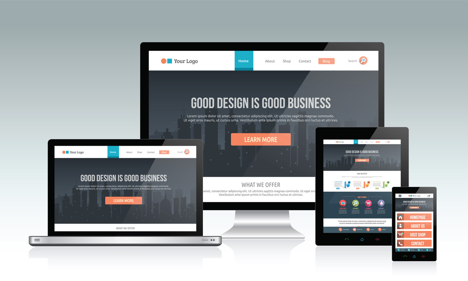
How will your website display on a laptop? A tablet? A smartphone? In 2015 Google announced the growing trend towards mobile internet use. For law firms, our research shows that more than 50% of people read our e-newsletters on a smartphone or other mobile device. With so many different screen sizes, your best solution is to make sure you use responsive web design. This means that the content and layout will adjust to best fit the viewer’s screen. If you’re not sure if your website is responsive, you can try it on your own smartphone or use an online tool like Google’s Mobile-friendly Test to see how your website rates.
Easy to read text
You want your website to be easy to read. Make sure to use a clear font, preferably one designed for on-screen reading, and use lots of white space. Meyer says breaking text into smaller chunks with white space in between makes the text easier to read and to remember. You could also try lists, bullet points or tables, depending on your content.
It’s also important to use plain English, short sentences and short paragraphs. Avoid using technical words where you can. Think about the type of words that will be best understood by your target audience. People also expect lawyers to write well and without mistakes, so make sure your message is clear and always check for typos.
Photographs and other images
Consider how images are used on your website. Do they convey information? Or are they decorative? Most likely, it’s a bit of both. For many law firms, staff photographs will be some of the main images. People like to see who you are, so make sure you have professional looking photographs and a consistent style. Despite the temptation to have a bookcase full of law reports as your backdrop, a plain, light-coloured background is best.
Accessible design
About one third of Australian households have someone with a disability and an estimated 4.2 million Australians have a ‘limitation, restriction or impairment which restricts everyday activities’ (Australian Bureau of Statistics). One everyday activity might simply be using the internet.
The World Wide Web Consortium, or W3C, provides guidelines and standards for accessible web design. They suggest you can improve your website’s accessibility by using alternative text for images, non-mouse navigation and high contrast colour schemes. Alternative text provides a text description of an image, making images accessible to people who use a screen reader because they can’t see the screen clearly or perhaps at all. Keyboard or non-mouse navigation is important for people who have difficulty seeing a cursor or controlling a mouse. High contrast colour schemes, for example black text on a white background, make text easier for everyone to read.
Improving web design, usability and user experience
Your firm’s website is an important part of your online presence. It’s important that visitors to your website enjoy a positive user experience. How long has it been since you updated your website? Perhaps you’ve seen some areas for improvement or found something you hadn’t considered before. If you want to know more about improving your web design, usability and user experience, Lift Legal can help. Give us a call to find out how.
About the author

Peter Heazlewood
Peter Heazlewood is a management and marketing consultant, he specialises in helping law firms develop their practices using business planning marketing and performance reporting techniques refined in his own successful law firm. Peter lives in Sydney with his wife and is the father of five adult children.
If you like this article please share on your favourite social media platform


